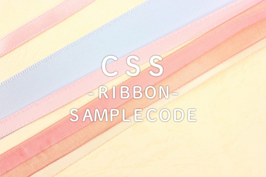
はじめに
見出しやワンポイントとしてよく使うリボンのデザイン。
画像データを探してきたり、イチから自分で作ったり、
準備からはじめるといろいろ面倒で大変。
ところが今では、CSSだけで簡単に作ることができるようになりました。
本日はコピペですぐ使えるCSSのリボンサンプルを少しだけご紹介いたします。
サンプルのご紹介
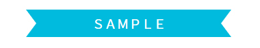
サンプルA:両端をカットしたリボン
HTMLの記述はこちら
<h3 class="ribbonA">SAMPLE</h3>
サンプルコード
.ribbonA {
    display: inline-block;
  width: 300px;
    position: relative;
    height: 40px;
    line-height: 40px;
    vertical-align: middle;
    text-align: center;
    padding: 0 40px;
    font-size: 18px;
    background: #00BBDD;
    color: #FFF;
    box-sizing: border-box;
}
.ribbonA:before, .ribbonA:after {
    position: absolute;
    content: '';
    width: 0px;
    height: 0px;
    z-index: 1;
}
.ribbonA:before {
    top: 0;
    left: 0;
    border-width: 20px 15px 20px 15px;
    border-color: transparent transparent transparent #fff;
    border-style: solid;
}
.ribbonA:after {
    top: 0;
    right: 0;
    border-width: 20px 15px 20px 0px;
    border-color: transparent #fff transparent transparent;
    border-style: solid;
}
スタンダードなリボンのデザイン。
記述方法は割愛しますが、heightの高さ指定を変えて細身のリボンにしたり
:beforeや:afterを非表示にすれば、片方をカットしたリボンも作れます。
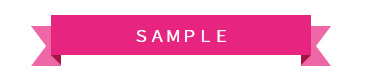
サンプルB:立体的なリボン
HTMLの記述はこちら
<div class="ribbon_wrap">
  <h3 class="ribbonB">SAMPLE</h3>
  </div>
.ribbon_wrap {
    display: inline-block;
    width: 300px;
    position: relative;
    height: 45px;
    vertical-align: middle;
    text-align: center;
    box-sizing: border-box;
}
.ribbon_wrap {
    box-sizing: border-box;
    height: 45px;
    margin: 30px auto;
    position: relative;
    text-align: center;
    vertical-align: middle;
    width: 260px;
}
.ribbon_wrap:before, .ribbon_wrap:after {
    border-color: #ee67a6;
    border-style: solid;
    bottom: -6px;
    content: '';
    position: absolute;
    width: 0;
    z-index: -2;
}
.ribbon_wrap:before {
    border-left-color: transparent;
    border-width: 20px 15px 20px 15px;
    left: -20px;
}
.ribbon_wrap:after {
    border-right-color: transparent;
    border-width: 20px 15px 20px 15px;
    right: -20px;
}
.ribbonB {
    background: #e72580;
    color: #fff;
    padding: 12px 20px;
    position: relative;
}
.ribbonB:before, .ribbonB:after {
    border: none;
    border-bottom: solid 10px transparent;
    content: '';
    position: absolute;
    top: 100%;
}
.ribbonB:before {
    left: 0;
    border-right: solid 10px #a61346;
}
.ribbonB:after {
    right: 0;
    border-left: solid 10px #a61346;
}
リボンのシャドウまでCSSでつくれます。
ポイントの見出しに存在感を持たせたい時におすすめです。
応用:背景に柄をつけたリボン
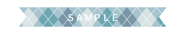
AのサンプルAのリボンに背景をつけたリボンです。
ちょっと手をくわえるだけで、マスキングテープのような仕上がりに。
背景以外にも、グラデーションをかけてみても面白いかもしれません。
まとめ
いかがでしょうか?
HTML5ができてから、自由度の高いデザインも
コーディング上で作れるようになりました。
コードをコピペするだけで誰でも作れるリボンのデザイン。
是非、デザインに取り込んでみてください!